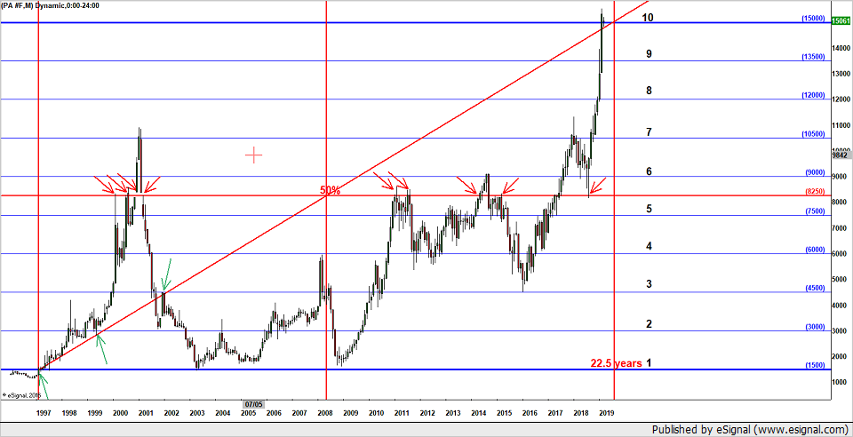
Interesting chart.
For starters, anytime price reaches 10 times the base it tends to get squirrelly. Why? I don't know, it's just an observation born of 30 years of lookin.
As far back as I have data for it looks like 2-97 price broke above 150 for the final time. 150 became the base until it began a stratospheric launch @12-08/82.50 culminating in this last hyperbolic move to 1500.
Price always drags behind it, or beneath it, a 50% line or point(reverse for down moves). As price goes higher the 50% goes higher. As it sits now the 50% is 82.50. Interesting how the 50% fits with all those old tops and bottoms. I have always wondered, when you see a chart line up like that, when the 50% is dragged into a place such as this, fitting the chart as it does now...do these old points(red arrows) create resistance for the high price. Does that make sense? Those old prices where set years ago...now the 50% has been dragged in to fit them...does that make the current high price...resistance and a top? for price to drag the 50% to the two highs at 1050(the 7th and death square of 150 according to Gann) price would have to attain a price of 1950...which would also be 1800(180 degrees of the circle) dollars from 150. Price at this point is 1350(135 degrees?) from 150.
Anyway...the diagonal line is from the first break of 150 on 2-97 and runs out to 22.5 years in time(half of 45). 22.5 years is 270 months...that comes out to 8-19 in time. Notice, as I place the diagonal from 2-97 to 8-19 I did not "fit" the line to correspond with price running up that line from 2-97 to 5-99 and the top at 1-02. This early formation and the 50% line nicely fitting the chart like it does might lend credence to the method. Maybe. It is Gann after all.
What does all this mean for future price action? Maybe nothing. This is my interpretation of what Gann was splainin. But if I had to guess as to future price activity I would say this is a possible good price for a top judging from the geometry of the chart.
As usual and according to Gann...we need to wait for a tell. What would that tell be? Price failing to hold above the 1500 price. Closes below 1500 would signal that 1500 was just too much for it to bear. Hyper buying has given up the ghost and down is to ensue. Sometimes, price will rapidly move into big time cycle ends, which would be the 22.5 years on this chart. Price could run down pretty hard from a break of 1500 until 8-19.
There exists the possibility that price maintains +1500 and runs up to that 1950 point by 8-19...dragging the 50% to the old highs of 1050.
That's a lot of jabberin for an explanation of a guess as to future direction. I'm more just putting my observations of Gann's stuff out there for any Ganners that might get something from it.
Time will tell but this is a good place to look for something to happen...good chart find.